Branding is image. We care about how we look and what we stand for. While holding fast to our value of body positivity, we knew that we had to shed some unnecessary pounds and streamline our focus and vision. We mulled over this transformation and had days of amicable (thankfully) conversations about how to reposition ourselves.
Our previous logo displayed our name, enclosed in a green box. Eponymous of our brand, we chose green to reflect ease and nature, hoping to project a calm effect on the viewer. However, the philosophy conveyed in that image was not compelling enough, and our message was lost in its simplicity.
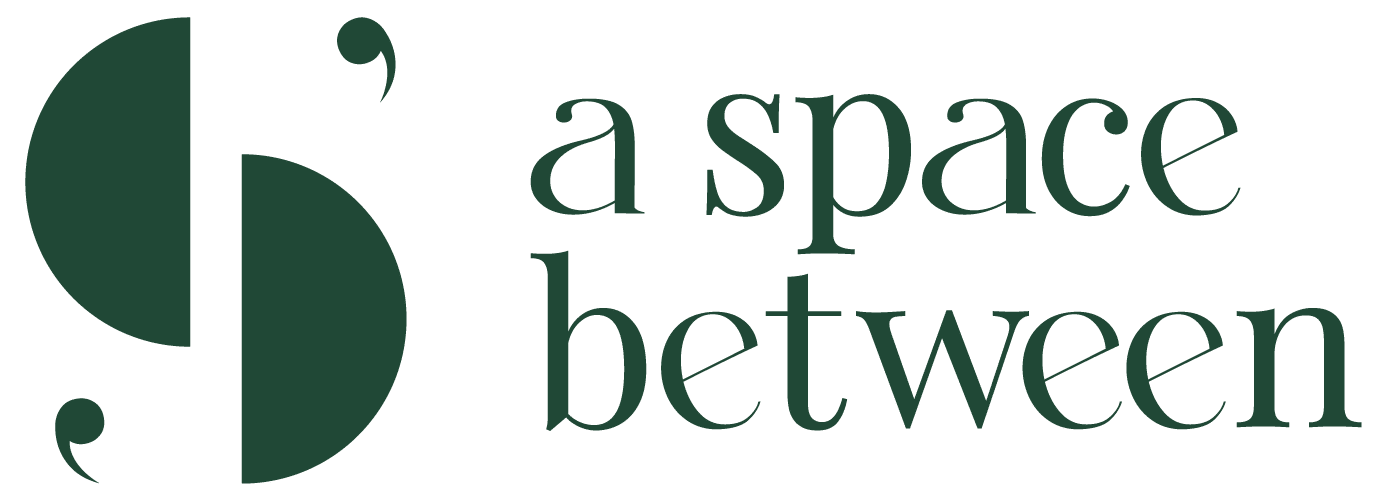
Under the expert craftsmanship of Selina, a visible change to behold is our logo.
With meaning in its every stroke, the brand new logo may not say a thousand words, but an important few. The alphabet S is an emphasis on ‘space’ and the letter’s curvatures reflect the brick and mortar facility’s organic quality.
The inverted commas tipping the letter S represent the meaningful conversations that take place in our premises. The conversations are confined and protected within the shape of the alphabet, which is the philosophy of our brand name, A Safe Space. The shade of green has been intensified from languid to invigorated, while staying true to its essence of tranquility.
Accompanying the logo is the brand name, spelt out in lower case, signifying a deviation from structure and regulations. Our attitude towards mental health wellness strays away from rigid and traditional perspectives, while abiding by classic and essential codes of ethics in the practice. This is subtly represented in the choice of a serif font – that has aged so well through the years.
A visual modification may seem like a modest gesture, but for us, it is an image that will remind us of our vision each time we glance at it – and believe us, that’s more times that you can imagine.
You can also be assured of our commitment of up-keeping this safe space for you.
Known as Nate, I am someone who cannot quit wielding the pen or punching the QWERTY, no matter where life brings me. Writing has always been the most effective conduit for channeling my wanted or unwanted opinions since I was an undergraduate at NUS. Naturally, I used this skill as a means of sustenance after working as a writer and editor for many years until I decided to start a business in music. That did not put a halt to my marriage with the vernacular.
In October 2016, I graduated with my Masters in Visual and Media Anthropology, which is the study of cultures through films and photography, at Freie Universität Berlin. This transitory period of residing in two cities has pushed the boundaries of my creativity and my battles with word count have not ceased.
Now a new mode of writing, the academic one, has been added to my existing smorgasbord of corporate and lifestyle collaterals, articles, advertisements, annual reports and books. At the moment, my learning curve is an uphill journey as I attempt to grasp the camera for stills and motion clips, while I juggle that with developing my love affair with my other mode of expression – electronic music.


